Zenclass Re Design
Zen Class web application is developed for online free bootcamp. I have been tasked to redesign the website to improve the overall quality of the design. Here is my approach…
Understanding of basic principles of UI
I have gone through the previous design and found the following flaws in the basic principles of the UI designs.
- There are no consistencies in the UI element arrangement.
- Design pleasing qualities are missing.
- Color balance is missing.
- There are no even patterns followed on the GUI element.
- GUI design is not attractive.
Considering the above facts, I have done the following changes.
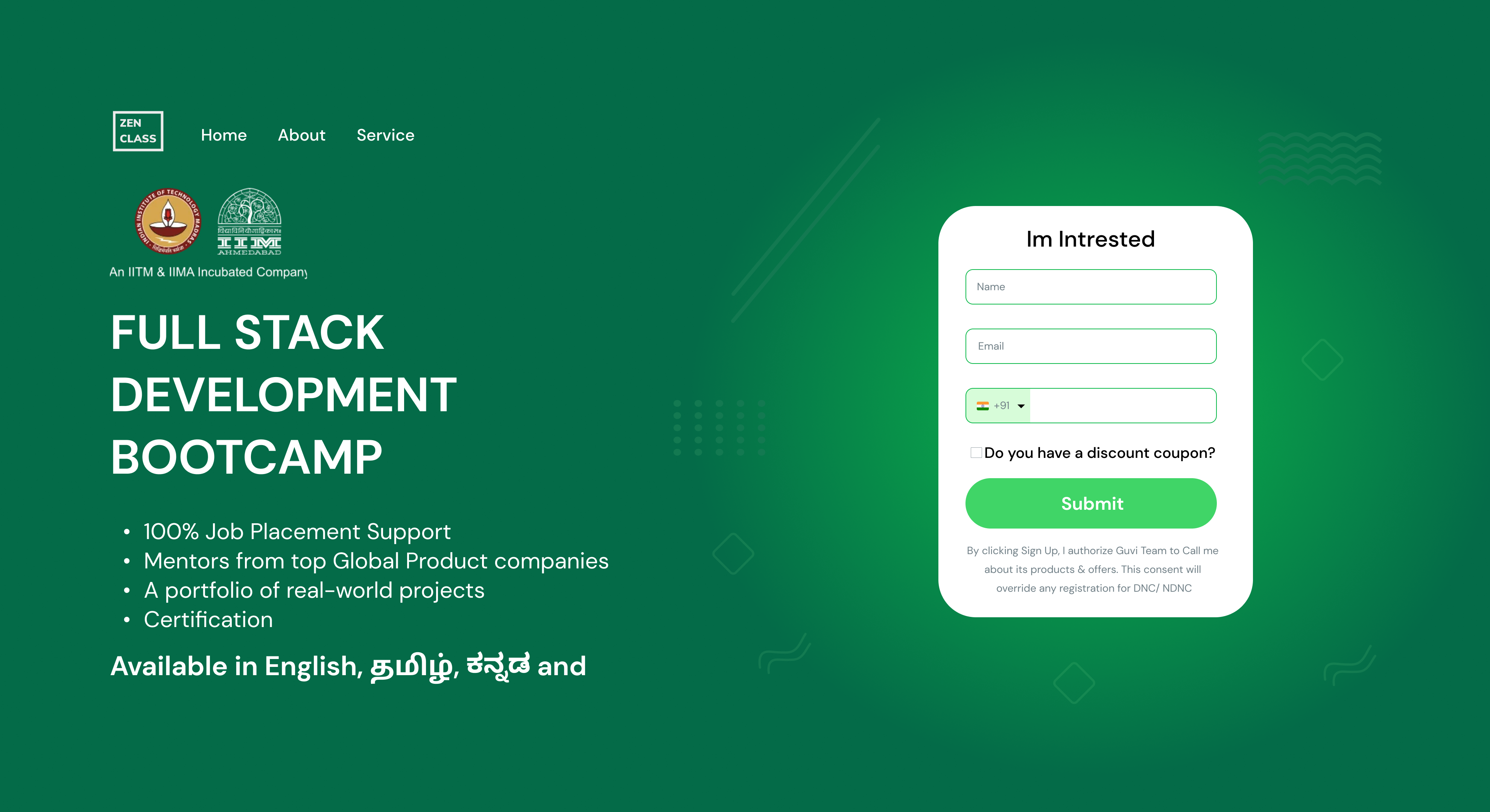
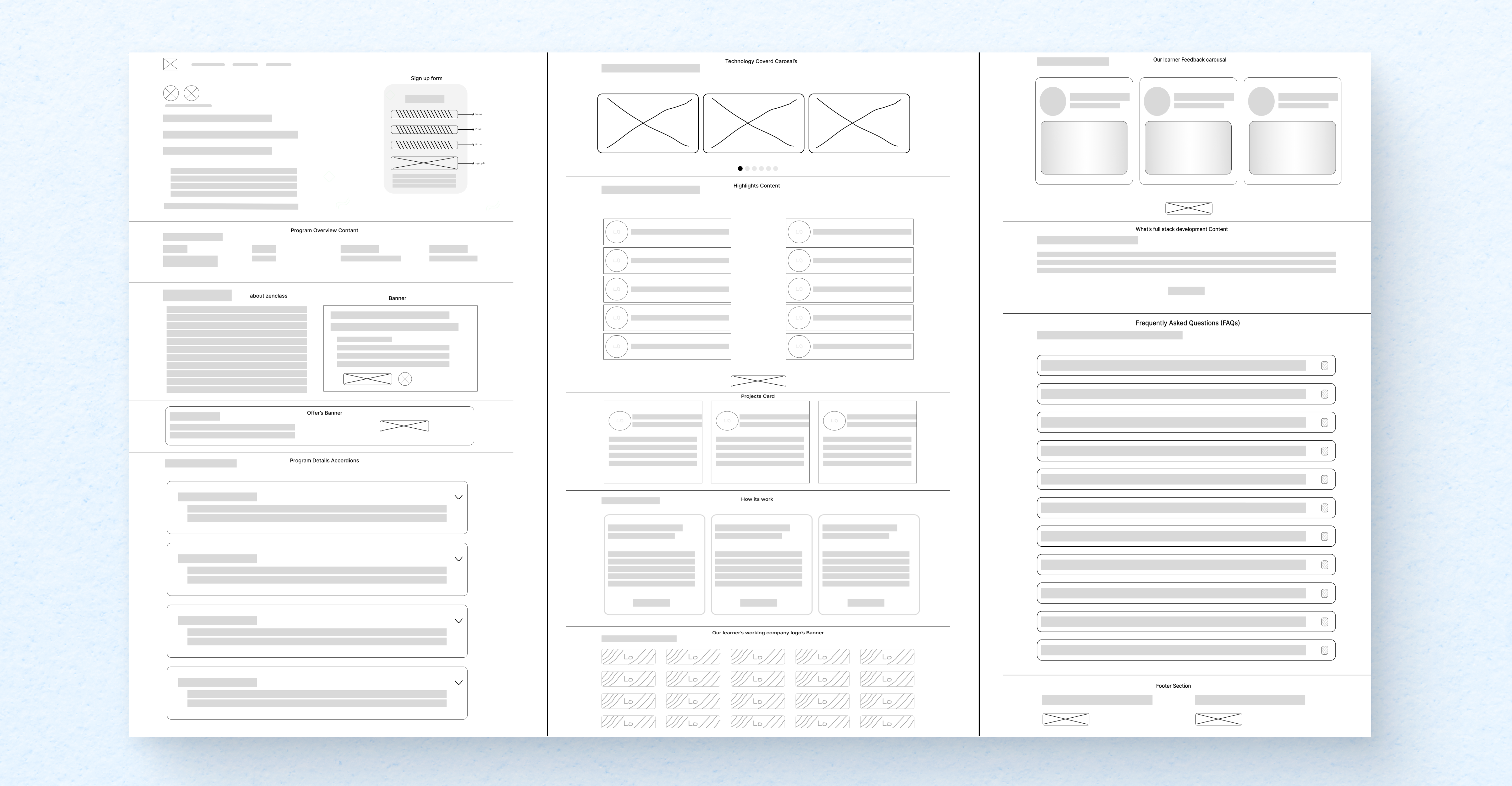
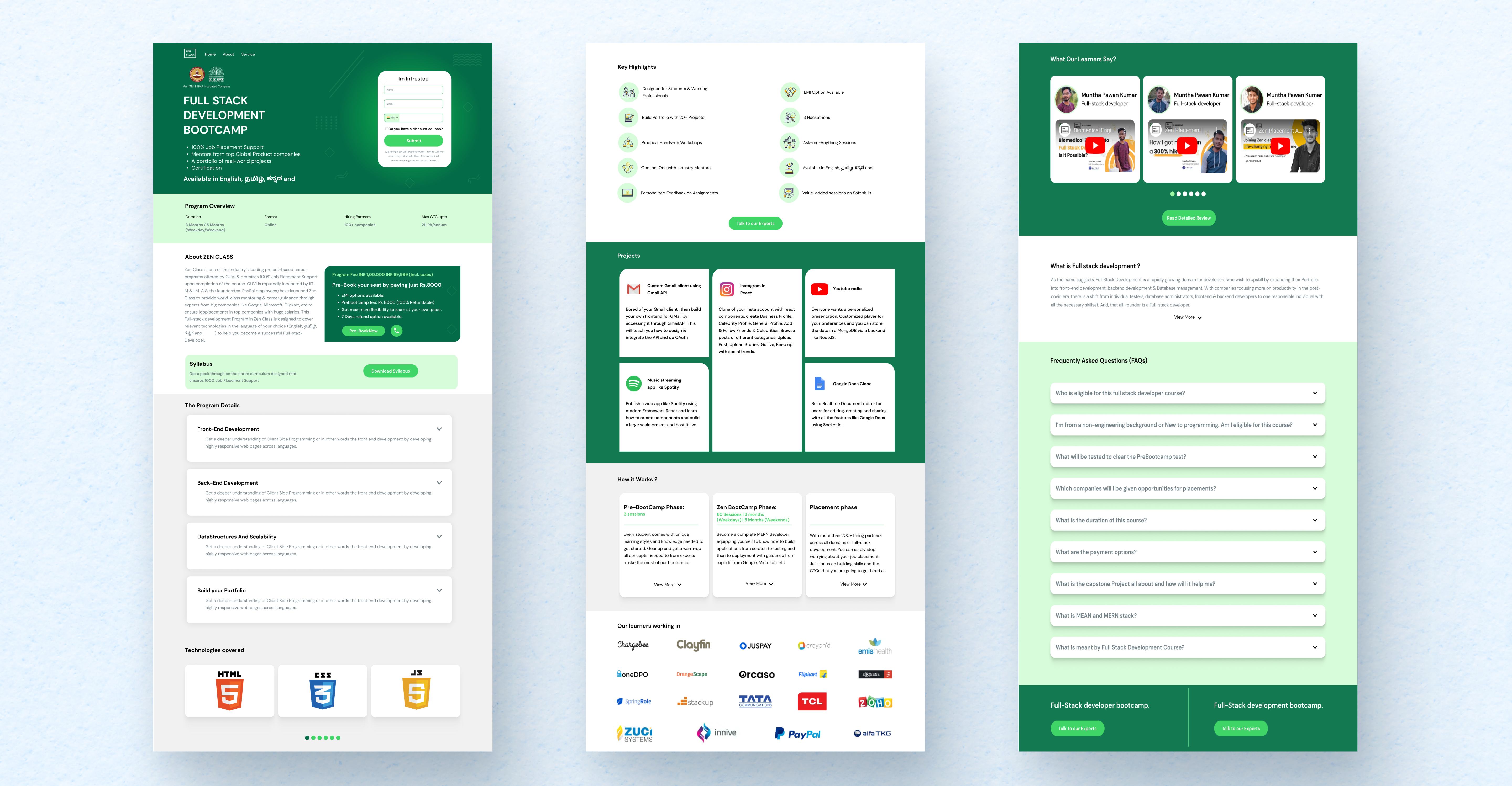
Header is redesigned and added default navigation for home and about page which is considered basic for any web design. Program overview section alignment has not been matching with other sections, which has been corrected now in the new design. About Zen Class header font size in no aligned with other section header which is now corrected. Also, the information has been used 12 column structure which is not necessary and now been aligned side by side with poster section for program fee to make uses of the real estate efficiently.
The program design panels curved radius increased to improve the pleasing design. Technologies section carousal button alignment corrected. Highlighted the logo background in the “Key High lights” section. Projects section design got improved. What our learners say section – Efficiently used real estate of the screen by aligning name with the photo of the learners Full stack developer boot camp section has been aligned side by side with the footer section to align the same information with one place in the UI.
Design aesthetic approach
- Used minimum color by following the given brand in the requirement. Most of the section.
- background square boxes are modified with curved edges to improve the pleasing’s.
- Improved user experience by aligning related information together.
- Improved header and footer.
- Themes followed to look and feel good.
- Fonts used to improve the overall quality of the web page as per requirement.
- Efficiently utilized the real estate of the screen.

Role
UI|UX Designer.
Duration
3 Months.
Tools
Figma, Adobe Photoshop, Adobe Illustrator, Papper and Pencil .


